Choosing Colours For Your Home
Did you ever dream of discovering a brand new, unique colour? I did. One that you or anyone else has never seen before. I must say, I found reindeer moss impressive the first time seeing it, with its yellow green I came to know as chartreuse.
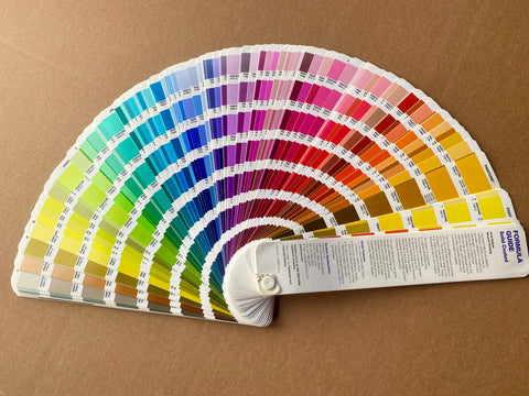
Pantone Formula Guide

Now I immerse myself with thousands of colours when I consult the Pantone Formula Guide. I use this when researching dye colours for a client wanting to match colours in their wallpaper or upholstery.
Keeping Up With Colour Trends
Every year paint companies announce new colours while Pantone and Dulux decree their often conflicting colours of the year. Does this mean we're making outdated choices for our homes? Are we meant to keep up with yearly trends when it comes to our decor choices? When we think about living sustainably, we try to spend our resources on choices that will last.
In this blogpost/article, we will look at what you might consider when creating colour schemes for your home. It can be daunting when the colour choices are so wide and varied. To help this daunting choice, here are a few thoughts regarding interior design and colour choices for your home.
Personalities and Stories

Your home is an expression of your personality and tastes, whether you’re a solo occupant or a family. Many people enjoy surrounding themselves with remindeders of aspects of themselves, these can include:
Book Displays
That might mean having prominent bookcases with previously read books.
Artefacts and Trinkets
You may want to surround yourself with memories from trips and experiences.
Soft Furnishings
Similarly, soft furnishings and textiles like rugs, cushions and curtains can add richness, stories and colour.
Plants and Nature
You may want to simply display a plant inherited from a loved one.
In my case it includes the first baby clothes my daughter wore as a newborn, framed in blood red. Any element has the potential to be the starting point for a colour scheme.
Colours From Experiences and Family
Similarly, the families and homes we’ve come from can inspire some of the threads that weave into the interior design of our homes. I grew up in a Spanish household in London. When I think of the colour scheme of my childhood kitchen, it is full of bright enamels and ceramics. Often seen in the sunshine colours of 1960’s Spain; yellow, orange and pale blue green.
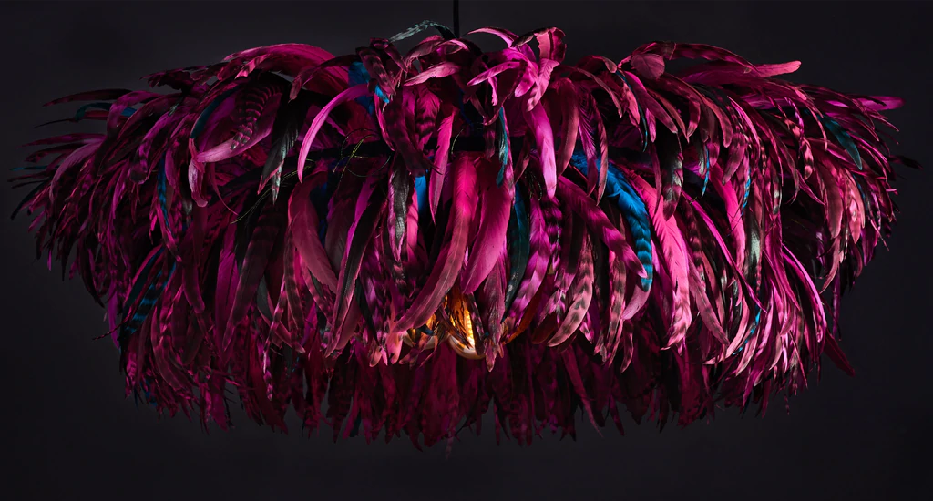
Finding Inspiration
I see now how these colours and references have carried through to my own kitchen. With its 1950’s polka dot orange Cola Cao tin as the starting point and accent colour throughout our kitchen and dining room. Including an orange Bertie, our two tiered feather chandelier, floating gracefully over the dining table catching the evening sun.
Natural Light and Atmosphere
If you are in a new home, it’s worth getting to know how the natural light affects your spaces. Are there rooms the light floods into? At what time of day? The seasons affect this too.
Impact of Seasons
In the autumn and winter when the sun is lower in the sky, the sunshine goes right through our open-plan house. Going in through the living room window and all the way out to the back garden. Knowing how the living room floods with natural light emboldened us to choose a dark blue. Farrow & Ball’s Stiffkey Blue, which makes the living room so cosy in the evenings, when we use it most.
Don’t Be Afraid to Go Dark
It seems counterintuitive but walls with a dark colour seem to retreat and make the room feel bigger than it really is. However, there are no hard and fast rules. The interplay of natural light and size are important to consider along with your desired effect.
Questions to Ask Yourself When Choosing a Colour
- Do you want a fresh and airy feel?
- A rich and enveloping atmosphere?
- Do you want your interior to convey a sense of fun or restraint?
- Do you like cool or warm toned colours?
There are far more questions than rules, it seems. To finish off, here are some rules you might find useful if colour choices are becoming overwhelming.
The colour wheel

This is a diagram that maps out the relationships between colours.
Primary Colours
The primary colours at the centre are red, yellow and blue. All other colours are from mixing these and adding black or white.
Secondary Colours
We create secondary colours, orange, green and purple, by mixing two primary colours. Tertiary colour possibilities are many as we form them by increasingly complex mixes.
Try a colour wheel here.
Using the Colour Wheel For Your Colour Scheme
You can use the colour wheel to compile the type of room scheme or colour palette that appeals to you. For example, an analogous scheme uses neighbouring colours, a complementary scheme uses colours that sit opposite each other on the wheel. A monochromatic scheme uses different shades and variations of the same colour.
60/30/10 ratio
A rule that I recommend for clients wanting a 3-way colour mix for a design from our Rio Collection, is the 60:30:10 rule.
What is the 60/30/10 ratio
This is where the main colour takes up 60% with 30% of a supporting. Then using a complementary colour and an accent colour that makes up the 10%.
Using the 60/30/10 Ratio
This colour ratio rule can be very useful as a guide for creating your own colour scheme at home. Your 60% could be the sofas and curtains with 30% in a rug. The remaining accent 10% can be a pop of contrasting colour in a feather light shade, reflected also in a cushion or two.
Learn more information on the 60/30/10 ratio rule here.
Concluding Choosing Colours For Your Home
These design principles can offer structure in your approach to achieving balance and visual interest in your home. Whether you free-style or employ the skills of an interior designer, the power of colour can elevate your home.